graphic design
From Logos ( be it for bands, events or fictional companies ), Icons & Layouts to diverse montages and various advertising concepts, you'll find it all in this section.

After playing around on this montage in my image editing program, I thought to myself that it would make for a good advertisement for a shoe brand that specializes in hiking footwear, so I came up with a name and a logo, and even a slogan. On the one hand, the quote is suggesting that with this brand of trekking/mountain shoes, every difficult hike looks like a walk in the park and makes mountains feel like simply walking on uneven ground. The slogan connects the viewer with a familiar song bearing the same title ( from Marvin Gaye ).

After working on a logo that is unique and would stand out among others in the physiotherapeutic trade, I implimented it for the business of my sister in law and with a business card and a certification stamp. I'm currently working on a whole CI in the same style ( flyers, website, brochures, stationery, ... )

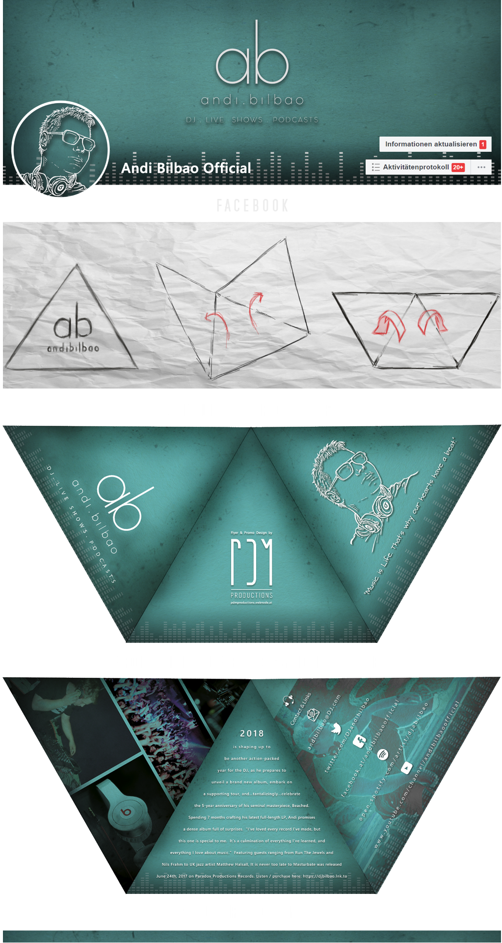
This is a unique concept for a flyer for my friend Andy, who requested my assistance on his public image, mainly on social media, but in a printed form as well. This three-fold brochure shows aspects of Andy's work and provides some additional information, like contact info and what he's been up to in 2018

I worked on another design for GroBar for their 'Niceantsnow' digipack release. The "bears" are all for their audience enjoying their music with a complimentary drink, so a USB stick in the form of a bottle opener was a logical decision!

Here is a joke based on wordplay that I 'brought to paper'. I heard the joke a while ago, and slowly the dots connected in my mind, leading to this concept for an advertisement for a brand of German dictionary.


Some time ago, I developed a few concepts for a hypothetical advertisement for the yellow pages. The problem is shown, and the solution (the yellow pages, of course) is added as a rhetorical question.

I chose the photo for this continuation of the established advertising campaigns from OAMTC carefully. Finding a photo which shows the viewer an accident that would hurt the wallet, but not any people, can be challenging. Hopefully, the viewer will focus on the proposed solution for any of their financial concerns.

Growing up in the Czech Republic, Kofola was, and still is the soft-drink of choice for me and many others. The picture depicts a simple concept for an ad where I too a photo of a limited edition Kofola in a glass bottle, then pepped it up in the traditional and refreshing style of many other famous brands. I used Kofola's original slogan in a more rhythmical form instead of its literal translation ( "Když ji miluješ není co řešit." ), in which the double meaning would be lost and wouldn't sound as natural when spoken out loud.

I've made many logos for various bands and music projects ( mostly for metal and hard rock groups ), but I made this one for an acoustic project. I'm particularly fond of this logo, made for a friend, as it represents the dreamy, melancholic, and gloomy style of his music.


Although I've designed much more than these three posters and flyers, the ones I've chosen to put here are my personal favorites - not including the one you can find on the 'Illustrations' page (which I consider my best poster yet!), which is an excellent example of my detailed and diligent illustration work.

